Use the logo properly
Use the logo properly!
In the interests of a consistent and recognizable presentation, it is essential that the logo be used properly. This means, among other things, that the logo should:
-
always appear at the top left
-
be used in its entirety (crest, slash and name) and its proportions may not be changed
-
retain the required white space around the logo
-
preferably be red but, if there is no other option, it can be white or black. In the latter case, however, the communication in question must contain a sufficient amount of red. The logo may appear in white or black in external house-styles. See logo against a coloured background
-
preferably be used with the horizontal variant
-
always be used with the English version for international target groups or contacts
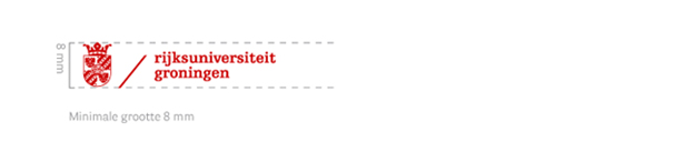
Minimum size of the logo
White space around logo
It is important for there to be sufficient white space around the logo, to prevent it from being ‘snowed under’ by other information. A white space (the free margin) is defined around the logo, based on the width of the crest. That width is the area around the logo that must always remain free.
Do not modify the logo!
The positions and sizes of the components are fixed and cannot be changed relative to one another. Thus, the following examples (and any other distortions of the logo) are not permitted.
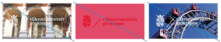
Logo against a coloured background
- The principal colour should, preferably, be used for the logo (Red PMS 186).
- Remember to provide sufficient contrast when placing the logo on a coloured background (also in external house-styles) and on photographic images.
- Any photographs bearing the logo should not contain too much detail.
- If the colour red does not provide sufficient contrast, the white logo can be used. Examples of how to use the logo against a coloured background

Last modified:12 November 2024 09.38 a.m.
View this page in: Nederlands